Thursday, 11 September 2014

LIFE AFTER PLASTIC

People of Earth, we have a problem. It's big, it's bad, it's ugly and it stinks. You already know all about the millions of tonnes of waste we dump on our beautiful green planet, so we won't harp-on about it here. It's time to focus on the positive plans afoot to create packaging that isn't rubbish.

Gregg Segal - 7 Days of Trash

Reducing…


Spanish company Laser Food etches logos and labelling onto fruit skin as an eco-friendly alternative to stickers and over packaging. This year, Marks & Spencer will trial the technology!

Puma say: 'The tens of millions of shoes shipped in our bag will reduce water, energy and diesel consumption on the manufacturing level alone by more than 60% per year.' Agreed! Very Clever indeed! 

Recycling


Creating an antidote for our global plastic addiction is a pretty gargantuan challenge. The eco.bottle®  is squaring-up to the task by supplying numerous product brands with a plastic alternative made from one of the most renewable and recyclable resources —paper!


Rethinking Materials


Daylesford Organic invested in Lean Pack by EcoLean, a material that breaks down into water, carbon dioxide and chalk. This material takes less energy to produce and transport, and generates less waste overall. Shame about the lack of brand visibility in the graphics, but well-done on the investment in an innovative sustainable material for a product that is a huge commodity in most Western Countries!

Revisting the past…

There's a lot of material innovation taking place to create sustainable packaging made from organic materials that break-down faster. Here in Asia, it's been happening since, well, forever! Future solutions can be found by both looking forward into material innovation and taking cues from historical solutions that have worked in the past...
Hideyuki Oka explains in his book on traditional Japanese packaging design, How to Wrap Five Eggs, 'the earliest packaging was accomplished by wrapping a given object in whatever material lay at hand. The outcome was often not only adequate for storing and transporting the object but might well have been a beautiful shape free of all excess and extravagance.'


Tuesday, 26 August 2014

CAN YOU JUDGE A BOOK BY IT'S COVER?

The glory days of book cover design is dead. Kindle stole it. Just like the way that the iPod stole the dust-sleeves on vinyl records and CDs that served as tangible, tactile works of art. Now the stakes are higher, the market fiercer and the reader just a little less bookish. One of the things we loved about books was how an awesome cover design could complement and enrich the whole reading experience and the way we connect to the story. 

Penguin publishing caused a stir recently with the launch of it's celebratory 50th anniversary book cover for the children's classic novel Charlie and the Chocolate factory. 


The initial view from 84 was...

'Yikes!'

'I don't get it at all?!! Is it another story that I missed??!!'

The cover did get the world at large thinking again about cover design though. It is certainly memorable, perhaps not in a good way, but it is attention grabbing, and you could say that's one sign of design success.

Another view from 84 -

'Roald Dahl always went with Quentin Blake drawings, like toast and jam or tea and biscuits. The lack of his drawings on the new cover is the main protagonist.'

Perhaps that's why the new book cover is, in the words of Miss Trunchbull, a "witless weed!" and totally off-brand. 


------------------------------------------------------------------------------------------------------------

We take a look at some other examples of the books that we have owned and the cover designs that left a lasting impression for us here at 84. 


'The messy looseness and eclectic energy of the typographic illustration perfectly captured the youthful naivety of Jonathan Safran Foer's brilliant debut novel. The hand drawn lettering both reflects and contradicts the seriousness of the title, whilst it's scale and single colour treatment grabs your attention.'


'Mine is "A Chance of Sunshine" by Taiwan's best-known author-illustrator Jimmy Liao.It's a story about 2 lonely individuals who never had a chance to meet even though they lived next to one another….Until one fine day.
I love the story so much that I bought the soundtrack too. What is special about Jimmy's story is he carefully selected a musical piece/song for every scene in his story that brings you into the tone and mood. One of my most played Cds in my collection. The story was made into a film to.'


'The cover for Murakami's Norwegian Wood is design perfection. Simple, very Japanese and bleak…Just like the story! There's a hidden visual message in it that I discovered after a few days of reading and studying the cover multiple times. When I noticed it, the cover design elevated the story to a different level.' 


Sunday, 13 July 2014

OUR WORLD CUP KIT DESIGN WINNERS AND LOSERS!

At the kick-off of the 2014 World Cup, 32 hopeful teams were kited out in an expertly designed home kit, an away kit, and not forgetting the home and away kits for the Goal Keepers as well. That adds-up to around 128 shirt designs gracing the Brazilian pitches during this years World Cup competition. Our design team share their views on the many triumphs and own goals of the kit designs.


Holland - Winner!

'I quite like Holland, lucky for holland, their country colour is so strong, Orange! I like the simplicity of design, single white colour lion logo and the typography of number on the back :)'

'Ok, maybe not very surprising. But I obviously love the Orange Dutch kit!!'


England - Loser!


'Why did we have a green goalie? Why!? This is so bad it probably helped us lose.'

'The mostly white kit is a bit bland in terms of colour - a bit like the player's style on the pitch! The detail in the tailoring of the slightly raised collar is a nice combination of classic and contemporary.'

'Where's is the red?'


Mexico - WInner!


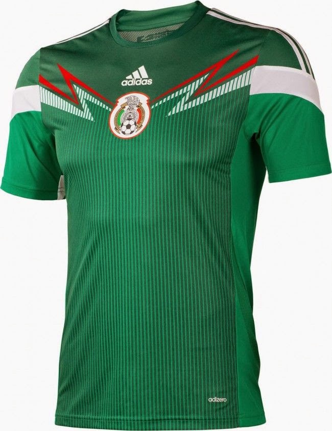
'The Mexico shirt has the emblem at the centre with the design flowing from it - which is quite unique compared to most of the other 2014 shirt designs as they mostly have nike tick or puma cat on the left and country emblem on the right. The lightening bolt style graphic on the Mexico shirt reminds me of the Mexican wrestler mask designs, which is a nice link to Mexico's visual culture.'


Argentina - Loser!


'Their kit is fine. But it reminds me of banana's in pyjamas.' 

'Argentina looks like the stripes have faded in the wash'


Cameroon - Winner!

'I love the design but probably for the wrong reasons! It reminds me of Christmas wrapping paper!'


Italy - Winner!

'The nation (after the Dutch boys) who wears their shirt with style are the Italians!!'

Sunday, 6 July 2014

3D PRINTING - FUTURE POSSIBILITIES

There are hundreds of things being commercially launched via the genius of the 3D printer – not just guns, as the naysayers would have us believe! There are 3D printed houses, bras, bottles, cars, shoes, furniture, food, fashion accessories, organs for transplant and so many more. Future possibilities are limited only by our own imaginations, and with the Christmas count-down looming, the race is on to see who will corner this market and deliver affordable 3D printing to the masses.

BetAdbram 3D Printed House
With its sights set on opportunities in the medical, automotive and fashion industries, 3D printing is destined to be a lucrative business for whoever becomes the major suppliers, but for us creative types, it's so much more than a commercial venture. My 2 favourites examples of 3D printing are more about the human spirit than the cold hard cash. I'm blown away by the seriously stunning and sexy prosthetic limbs from industrial designers such a Scott Summit http://www.bespokeinnovations.com, and also the tiny little fluro shells created to save an endangered species of Hermit Crab by Markerbot's Project Shellter https://www.facebook.com/ProjectShellter. Stuff like this really warms the cockles of the heart. 

Bespoke Innovations 3D Printed Prosthetic Limb

Marker Bot's Project Shellter - 3D Printed Shell For Endangered Hermit Crabs

On an industrial level, we should all be very excited by the prospect of a design production method that shakes-up the current status quo of waste, which we inherited from a past generation of designers who had little concern for sustainability. 3D printing reduces carbon emissions and the need for long distance transportation, as well as the wasteful prototype process. As a new forward-thinking innovation, the final outputs of 3D printing have been developed to involve sustainable materials which are better for the long term health of our lovely little green planet.

This is all awesome stuff. In addition to the environmental benefits, the other thing about 3D printing that really gets the heart pumping is the potential for creative expression, and not just for us designers. Like Lego, Play-Dough, and Etch-a-Sketch before it, 3D printing is the conduit for imaginative play and creative learning. A company in the US called Mission Street Manufacturing are crowd sourcing on kick-starter for an affordable 3D printer called Printeer coupled with a child friendly app through which a child can design bespoke creations. With any luck, Printeer is on track to be available in time for Christmas. At the time of this blog there's 3 days left to get involved here https://www.kickstarter.com/projects/2001363001/printeer-a-3d-printer-for-kids-and-schools
There are already easy-to-use apps available that are designed to work with 3D printers. My favourite is Monstermatic which helps you to create kooky monster figurines http://www.monstermaticapp.com…there goes my weekend!
Monstermatic - A Mobile App For Designing Your Own 3D Printed Monster


Monday, 17 March 2014

SHIRANU GA HOTOKE

All aboard the Osaka Monorail to Nagano Sake Mountain - a mishmash beauty bromance unfolding amongst a kawai kaleidoscope of twitching eels, poncho combos,pink cheeked monkeys and innocent back scrubbing in the Olympic Onsens of so-cold-it's-hot Hakuba.

Losing ourselves and finding each other amongst the whitest snow and the purest air, first-time-wedgers longtime-helmets and medium-pole-droppers careering our way to Harry Henry's Holiday Inn - falling and laughing, dancing and snowball fighting through submarine showers, sumo steamboats and sake shots.


Under perfect blue Omotesando skies we zigged, zagged and Shin-Ju-Kued our way through quirky fusion Harajuku to the Shibuya crossing, peaceful temples sashimi towers 4am tuna auctions and the freshest fish ever before a Northern Soul all nighter in Roppongi for the kids.

A cataclysmic carnival of robot-girls drums dragons and pandas, ro-mantic serenades from Mr Bombastic and the cheeky girls. The elegant hostess with the mostest in the smallest of small Golden Gai bars; four days and nights of awesome food, never-give-up-spirit and tender togetherness… Sayonara!


Monday, 6 January 2014

A SMALL DOT IN AN INFINITY NET

Yayoi Kusama exhibition “A Dream I Dreamed”, held in the Museum of Contemporary Art, was a great excuse for another visit to Shanghai art museum. The exhibition offered a rare opportunity to see Yayoi Kusama’s recent works and it wasn't disappointing…


Throughout her career, Kusama has worked in a wide variety of media; painting, collage, sculpture, performance art and environmental installations, most of which exhibit her thematic interest in psychedelic colors, repetition and pattern. A precursor of the pop art, minimalist and feminist art movements, Kusama influenced contemporaries such as Andy Warhol and Claes Oldenburg. Kusama is now acknowledged as one of the most highly-regarded living artists to come out of Japan, and an important voice of the avant-garde.
After experiencing psychiatric problems, in 1977 she voluntarily admitted herself to a hospital, where she spent the rest of her life. From here, she continued to produce artworks in a variety of mediums.

For those unfamiliar with Kusama’s work, the paparazzi nicknamed Kusama the Polka Dot Princess in the 1960s when she lived in New York City, you’ll quickly understand why…

No artist embodies a life of obsession quite like Yayoi Kusama. As a child, she began seeing polka dots everywhere she went. For over 70 years the enigmatic, troubled artist explored the circle as a metaphor, a pattern, a disease and a cure.
What I find fascinating about Yayoi Kusama is that she has transformed her nightmares into art… madness or genius?

This exhibition is a showcase of over 100 pieces of Kusama art on her habitual theme of losing oneself to the infinite fabric of the universe, acting as a small dot in an infinity net. Through her immersive installations, her viewers become privy to her expansive hallucinations as she encourages them to "Forget yourself. Become one with eternity. Become part of your environment. Make love."

Kusama talks about the inspiration for her works as “a polka-dot has the form of the sun, which is a symbol of the energy of the whole world and our living life, and also the form of the moon, which is calm. Round, soft, colorful, senseless and unknowing. Polka-dots become movement... Polka dots are a way to infinity."


Sources:

In the fashion world, Yayoi Kusama and the polka dot are also a large source of inspiration used by designers as you can see bellow.

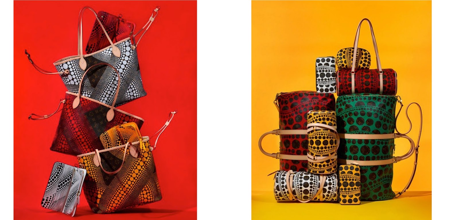
Marc Jacobs used also a lot the graphic dot pattern for his perfume collection DOT or in his clothing collection. He collaborated also with the Japanese artist for Louis Vuitton.

Last September, an entire Yayoi Kusama for Louis Vuitton Bag Collection was launched, featuring Vuitton icons, duffle bags, evening bags and also some specials that you will not find in the main line. Kusama’s dot designs were mixed with the iconic Louis Vuitton monogram design.


In the December 2013 Art Issue, W Magazine, Yayoi Kusama was enlisted, creating both the set and customizing the suit that George Clooney is wearing.


And of course there is another celebrity famous for wearing polka Dots…

Contemporary packaging design also draws inspiration from that strong graphic dot  pattern..

Sources:

So those little dots, so hypnotizing for Yayoi, still have infinite artistic possibilities ahead and continue to obsess the human mind…

Anne Laborde, Design Director

THANKS FOR ALL THE FISH, 2013. 2014 - HERE WE COME!


And so another great year comes to an end and what's the holiday season without celebration! With our Santa hats on, the team wound up the year in a fashion befitting of the wonderful year that it has been, ringing in the festival cheer at the studio Christmas party. As the heady aroma of the brewing Gluhwein wafted through the agency, the office was filled with excited chatter and the always-welcome sound of wrapping papers being torn open.


The Secret Santas this year ranged from supportive of age old habits, exhibited by the Gin & Tonic kit to thoughtful and social service oriented, as displayed via the Belt of Honour.


As some of us tried guessing who our Secret Santas were, others were busy gorging on the delectable goodies including the H&M branded apple pie by resident baker Monique and the Christmas Tree cake by Zonna.


It's been a lovely year with lots to be proud of and lots more to be grateful for. So as we pull up our socks and gear up for an even better 2014, here's wishing all of you the happiest New Year from all of us at H&M.


Video:


Sharanya Venkataraman, Account Executive
Jay Sunwoo, Designer