Yayoi
Kusama exhibition “A Dream I Dreamed”, held in the Museum of Contemporary Art,
was a great excuse for another visit to Shanghai art museum. The exhibition
offered a rare opportunity to see Yayoi Kusama’s recent works and it wasn't disappointing…
Throughout
her career, Kusama has worked in a wide variety of media; painting, collage,
sculpture, performance art and environmental installations, most of which
exhibit her thematic interest in psychedelic colors, repetition and pattern. A
precursor of the pop art, minimalist and feminist art movements, Kusama
influenced contemporaries such as Andy Warhol and Claes Oldenburg. Kusama is
now acknowledged as one of the most highly-regarded living artists to come out
of Japan, and an important voice of the avant-garde.
After
experiencing psychiatric problems, in 1977 she voluntarily admitted herself to
a hospital, where she spent the rest of her life. From here, she continued to
produce artworks in a variety of mediums.
For
those unfamiliar with Kusama’s work, the paparazzi nicknamed Kusama the Polka
Dot Princess in the 1960s when she lived in New York City, you’ll quickly
understand why…
No
artist embodies a life of obsession quite like Yayoi Kusama. As a child, she
began seeing polka dots everywhere she went. For over 70 years the enigmatic,
troubled artist explored the circle as a metaphor, a pattern, a disease and a
cure.
What
I find fascinating about Yayoi Kusama is that she has transformed her
nightmares into art… madness or genius?
This
exhibition is a showcase of over 100 pieces of Kusama art on her habitual theme
of losing oneself to the infinite fabric of the universe, acting as a small dot
in an infinity net. Through her immersive installations, her viewers become
privy to her expansive hallucinations as she encourages them to "Forget
yourself. Become one with eternity. Become part of your environment. Make
love."
Kusama
talks about the inspiration for her works as “a polka-dot has the form of the
sun, which is a symbol of the energy of the whole world and our living life,
and also the form of the moon, which is calm. Round, soft, colorful, senseless
and unknowing. Polka-dots become movement... Polka dots are a way to
infinity."
Sources:
In
the fashion world, Yayoi Kusama and the polka dot are also a large source of
inspiration used by designers as you can see bellow.
Marc
Jacobs used also a lot the graphic dot pattern for his perfume collection DOT or
in his clothing collection. He collaborated also with the Japanese artist for
Louis Vuitton.
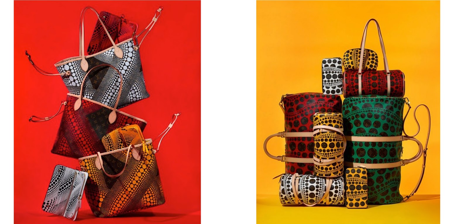
Last
September, an entire Yayoi Kusama for Louis Vuitton Bag Collection was launched,
featuring Vuitton icons, duffle bags, evening bags and also some specials that
you will not find in the main line. Kusama’s dot designs were mixed with the
iconic Louis Vuitton monogram design.
In
the December 2013 Art Issue, W Magazine, Yayoi Kusama was enlisted,
creating both the set and customizing the suit that George Clooney is wearing.
And of course there
is another celebrity famous for wearing polka Dots…
Contemporary
packaging design also draws inspiration from that strong graphic dot pattern..
Sources:
So
those little dots, so hypnotizing for Yayoi, still have infinite artistic
possibilities ahead and continue to obsess the human mind…
Anne Laborde, Design Director