
At the kick-off of the 2014 World Cup, 32 hopeful teams were kited out in an expertly designed home kit, an away kit, and not forgetting the home and away kits for the Goal Keepers as well. That adds-up to around 128 shirt designs gracing the Brazilian pitches during this years World Cup competition. Our design team share their views on the many triumphs and own goals of the kit designs.
Holland - Winner!


'I quite like Holland, lucky for holland, their country colour is so strong, Orange! I like the simplicity of design, single white colour lion logo and the typography of number on the back :)'

'Ok, maybe not very surprising. But I obviously love the Orange Dutch kit!!'
England - Loser!


'Why did we have a green goalie? Why!? This is so bad it probably helped us lose.'
'The mostly white kit is a bit bland in terms of colour - a bit like the player's style on the pitch! The detail in the tailoring of the slightly raised collar is a nice combination of classic and contemporary.'
'Where's is the red?'
Mexico - WInner!
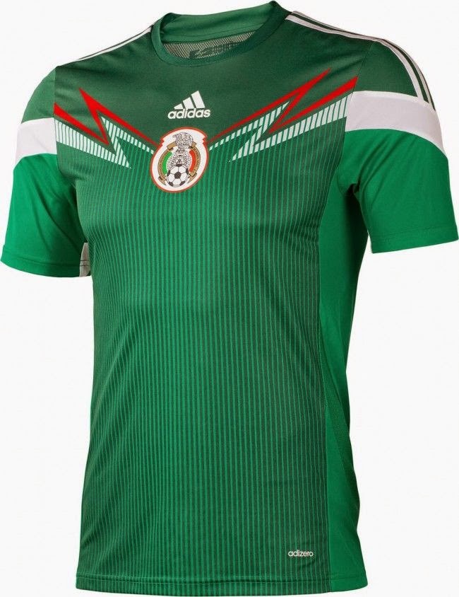

'The Mexico shirt has the emblem at the centre with the design flowing from it - which is quite unique compared to most of the other 2014 shirt designs as they mostly have nike tick or puma cat on the left and country emblem on the right. The lightening bolt style graphic on the Mexico shirt reminds me of the Mexican wrestler mask designs, which is a nice link to Mexico's visual culture.'
Argentina - Loser!


'Their kit is fine. But it reminds me of banana's in pyjamas.'
'Argentina looks like the stripes have faded in the wash'
Cameroon - Winner!

'I love the design but probably for the wrong reasons! It reminds me of Christmas wrapping paper!'
Italy - Winner!

'The nation (after the Dutch boys) who wears their shirt with style are the Italians!!'
No comments:
Post a Comment