Thursday, 31 October 2013

DIVERSI-TEA AROUND THE WORLD

As the second most popular drink in the world after water, tea plays many different roles in the hearts and lives of consumers across the world.

In Britain, anything is solved with a cup of tea... if you have a problem, you talk about it over a cup of tea.  Occasions are marked by tea across the country, whilst every region from North to South has its own nickname for this historic drink. 


Popular slang for a cup of tea in the UK (source: seasideair.blogspot.com)

Tetley Tea ad in the UK  (source: www.marketingmagazine.co.uk)

In Singapore, tea lounges have increased in popularity, cultivating consumers’ tastes for speciality tea and tea-drinking in general. 


High tea in Singapore (source: sg.lifestyleasia.com)

TWG Lounge, Singapore (source: www.twgtea.com)

The earliest tea consumption recorded was in China, 10th Century BC and today, and today we see 3 billion cups of tea consumed daily, from China to India, Japan and Taiwan.

Tea being harvested in China (source: http://www.jas-etea.com/tea-in-chinas-hinterland/)


An innovative category


Tea brands come in all shapes and sizes, from small privately owned labels specialising in niche flavours to global brands who tailor their offer to the preferences within each market; catering to those who drink tea as a functional thirst quencher, to those who want to savour the experience of drinking a unique blend.

Lipton in Philippines  (source:www.shopcrazy.com.ph)

Twinings in Japan (source: global.rakuten.com)

Teapigs in UK (source: http://www.teapigs.co.uk/)

"Christmas Tea" in Europe (source: http://www.designswan.com)


Bubble Tea in Taiwan (source: http://en.wikipedia.org/wiki/File:Bubble_Tea.png)


Sparkling RTD Green tea in Korea (source: company.lottechilsung.co.kr/eng/‎)


Snapple Iced Tea in USA  (source: www.snapple.com)


According to research, 79 billion servings of tea were drunk in the USA in 2012 and this number is on the rise.  Stereotypically, the US is a nation of coffee lovers so this quite a surprising fact.  This fact is one that is a hot topic of recent trends in the tastes of the American beverage consumer.  Not only are diet drinks becoming less popular due to the bad press of artificial sweeteners, but the popularity of tea is rising.  In response to this, coffee giant Starbucks (who dropped ‘tea and spice’ from their name) is now spreading their hot drink wings, having bought Teavana, a national US chain that specialises in ‘common and rare tea varieties and blends’.  According to the Economist, this will enable Starbucks to take on the $90 billion global hot and iced-tea category.


Teavana chain in USA  (sources: www.teavana.com, economist.com)


What does this mean for the rest of the world?  Will this acquisition result in Teavana becoming to tea, what Starbucks is to coffee on a global scale?  Starbucks took on America and then the rest of the world, and to a lot of people became the generic for how people would view a ‘brand coffee’ (at least the takeaway kind).  But, with such differing values of what tea means to consumers from one country to another, it’ll be interesting to see if Starbucks can create a ‘brand tea’.

How do you drinks yours? (source: http://imgfave.com/view/2400836)


Sophie Tyrrell, Business Development Manager

SHANGHAI OFFICE HALLOWEEN NIGHT!


The guys in Shanghai got a little inspiration from one of our ongoing projects for this years halloween. Asked the reason why they had this theme Juney replied 'We are designers! WE have to be different and special!! So let's be toothpaste!

The public gave them a lot of attention out on the street, so much that they felt famous by the end of the night.  And to top it all off, they'd even won the prize for the best costumes in the club!


Thursday, 24 October 2013

BOOM BOOM POW!


Although storytelling through pictures has been in existence as far back as history can tell, comics were first introduced in the 1890s. The Yellow Kid is largely considered to be the first comic strip, debuting in a Sunday supplement in America in 1895.  It brought with it the “word balloon” as its creator Outcault put it and has given us what is now an iconic staple in not only the comic world, but the lexicon of art and design as a whole – the speech bubble. In 1937, Detective Comics, or as we all know it today - DC Comics, released its first issue and kick-started what academics call the Golden Age of comics, a.k.a – the re-definition of childhood. The world of superheroes, fantasies and general awesome-ness had begun. 

The Yellow Kid comic strip. Photo courtesy: www.lambiek.net
The first issue of Detective Comics. Photo courtesy: wikicommons 

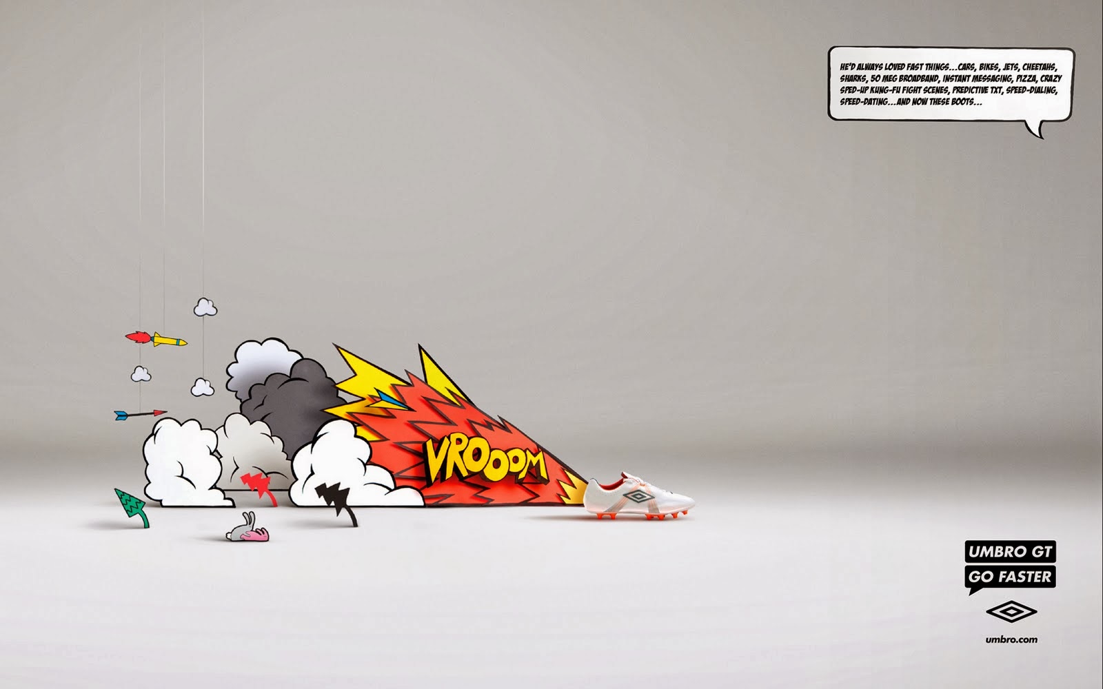
Over the years, apart from being one of the most effective (and enjoyable!) mediums of story telling, comics have lent themselves to the world of design through their illustration style. The comic style of illustration has achieved a cult status of sorts, often being associated with kitschy design concepts. We come across this style of illustration in almost all forms of commercial design & communication – 

PRINT ADS

1934 Advertisement for Nestle in a comic strip style. Photo courtesy: sparehed.com

Umbro Go Faster Print Ad. Photo courtesy: lovecreative.com


Volkswagen Emergency Brake advertisement. Photocourtesy: coloribus.com


FASHION 


Photos courtesy: bearshoes.com, brilliant-apparel.com, timeoutchicago.com, geekpinata.com


PACKAGING


DKNY Be Delicious Special Edition Packaging. Photo courtesy: geniusbeauty.com

MAC Wonder Woman Limited Edition Collection. Photo Courtesy: style.com


3R Tequila packaging. Photo courtesy: thedieline

Limited Edition Wine Bottle labels by Australian design agency The Creative Method. Photo courtesy:trendhunter.com

The comic style is iconic, recognizable and instantly garners curiosity and interest as it is associated with a story and a “What happens next?” sentiment, thus successfully grabbing the attention of the audience or consumer. It humanizes the design, adds personality, is uplifting and creates a generally positive feeling within the viewer. Comics and the comic illustrative style also seem to have a unique quality of evolving and being current and trendy while still staying vintage, quirky and old-school at the same time. In commercial design, this style helps make the product standout from a crowd and often puts an excited smile on the consumers face, regardless of age.

On that note, here’s something to put a smile on all our faces – wise words from the most profound 6-year old that ever was..

Image courtesy: chutzpah.typepad.com

So tell us, what’s your favourite comic strip or book and if you could design your own comic inspired item, what would it be?

Additional Credits:  Wikipedia.org and The Comics – An Illustrated History of Comic Strip Art 1895-2010, by Jerry Robinson

Sharanya Venkataraman, Account Executive

Monday, 21 October 2013

YOUR IDENTITY - A PRECIOUS COMMODITY

Our new personalized name cards have made me think about how each of us has our own unique and individual identity, and how important it is in today’s world.


When we are children our identity is constantly developing. It evolves with each experience, eventually forming our own unique personality.


 As we grow older we begin to look to others for influence. We become more aware of the environment around us and are shaped by social interaction. We begin to think about how we are perceived and look to outside factors to define ourselves. The group we belong to, the clothes we wear, the music we listen to, it all adds up to create a unique picture of who we are and how we want to be seen by others.

 
In the past, our tools for self promotion would have been restricted to a thoughtfully designed resume or carefully chosen outfit. Today it is easier to define our identity and to tailor it through social network sites. Now like a business we need to think about content management. How are we represented in the digital space and how does this affect our identity?

 
Saying all of this, we need to remember that our identity is precious and unique to us. Although it easy to manipulate, authenticity is key. Like any successful company if our identity is not founded on core values it is just window dressing.

Gavin Romanis, Senior Creative Artworker / Retoucher

Friday, 11 October 2013

WHISKY, GIN, VODKA OR RUM?


Category codes in every sector of design are important, and nowhere more so than in drinks design. 

Guess Who?

Whilst the designs are doing a reasonably good job to convey the category, the bottles are not helping. Familiarity is key to a consumer’s decision making when purchasing from the shelf.
This makes it essential that the label design conveys enough of the category codes. In the lineup it is not immediately obvious which product is the vodka or the gin, in the same way you would be forgiven for picking up the rum thinking it was a whisky.


Monkey Shoulder is a great example of a brand using a stock bottle; its memorable embellishment of three monkeys gives uniqueness and the label has subtle whisky codes through the type and malt masters signature. The choice of stock bottle with its rounded shoulders, cork stopper and heavy base also evoke whisky codes.


Which one of these brands is a wine?


On first glance, the middle bottle perhaps? The wine is in fact on the left, California Square, the other two products are olive oils. The idea of using a square bottle for a brand called California Square is absolutely rational. However, as the structure is breaking out of traditional wine territory and the graphics need to convey wine codes. Instead what we see is a very nice typographic treatment that would fit on a number of premium products.

Rules are made to be broken?

Royal Stag Barrel Select is a more premium variant of Royal Stag Whisky. It is successful in being a more premium looking product and the screening also gives it a modern, stylish finish. The issue is that the structure is too angular and tapered in an attempt to further its modernity.  The brand consequently ends up giving an overall impression of vodka.


Camitz vodka breaks the category to accentuate the unique qualities of the brand. The champagne bottle is used as a witty way to show the vodka is sparkling. It all works, as the design intention was clear and it was executed accordingly.

The essential principle is that structural design and 2D design should always work in harmony with each other, never forgetting the message the brand is attempting to convey.


Sam Neill, Senior Designer


Thanks for the pictures:
thedieline.com, atipus.com, hiphipgingin.com, rumgallery.com, coolhunting.com, holidayspiritzbazaar.wordpress.com, luxist.com, sesnicturkovic.com, whiskyintelligence.com, loveleypackage.com